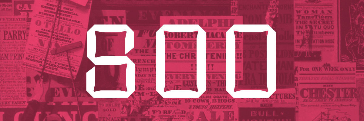
Type Lessons From The Nineteenth Century
with
Marta Bernstein
For most of the 20th century decorative type was not taken seriously: Modernism with its “less is more” made it superfluous. Ornament was a crime for a long time.
But now those lettershapes are making a comeback: we see more and more display typefaces designed to be used at large sizes, mainly for titles or short sentences, and whose personality has to be apparent in just a few letters. Not created to be timeless, or with readability in mind, they catch better than others the spirit of the time.
How much contemporary type owns to the Victorian era? We will go back to the origin of display typefaces and investigate the wild yet systematic experimentation that generated them. And will see if there is a lesson to be learnt.
The Herb Lubalin Lectures are recorded and made available here and on Vimeo with the generous support of TypeCulture.
About Marta Bernstein

