Principles of Typeface Design: Pen to Pixel
with
Hannes Famira
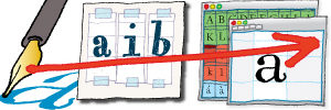
This course is for anyone who has always wanted to design their own typeface, but is unsure where to start. Or for those who just love type, and wish they knew more about how it works. The participants will engage with the fundamental methods, tools and principles involved in the making of a digital typeface. For participants with more ambitious personal goals additional guidance will be provided for efforts between class sessions.
The course will take the participants from basic sketching through hand-drawn type to the digization of their own, original letter forms. Working with each student step by step through the process of creating a working typeface of their very own, this course will provide a fundamental understanding of how typefaces work, both technically and aesthetically, and experience in making them.
Beginners are welcome, as are more experienced participants. A working knowledge of bézier drawing tools (ie. the pen tool in Illustrator) as well as some background with either lettering or typography are recommended but not required. Students must be able to work on their own laptop, running Mac OS 10.6 or higher; free temporary licenses for Robofont, the new standard application for typeface design, will be made available to all participants.
About Hannes Famira

Hannes Famira is founding principal of FamiraFonts. He is a graphic designer, a type designer and a teacher of both disciplines. After 20 years in the Netherlands, Germany and Switzerland he now lives in Brooklyn, New York.
His library of retail typefaces is available from Adobe Fonts, Type Network and I Love Typography. You can see work in progress at Dribbble. Companies like Céline, Helmut Lang, GoDaddy, Mansur Gavriel and Theory have commissioned custom tailored logo and corporate typeface solutions. Most recently Hannes drew a typeface for the opening titles of the AMC television show Interview With The Vampire.
Hannes’ understanding of type comes mostly out of his Dutch design education at the Royal Academy in The Hague (KABK). With a painter for a mother and neo-modernist architect for a father his earliest influences are based in a love for Scandinavian and traditional Japanese design. Combining the freedom of painting with the structured thinking of architecture seems to have quite naturally led him to type design at the center of his creative work.
After having worked at Meta Design, at the Buro Petr van Blokland and at House Industries Hannes started his own design studio Das Kombinat in 1999. He added Kombinat-Typefounders in 2001 and renamed it FamiraFonts in 2016.
An ongoing practice of teaching type has been the most formative influence on Hannes’ thinking since his years as a student at KABK. He has been teaching in the Type@Cooper Extended and Condensed programs at the The Cooper Union since January 2011. Currently holds the Stuckeman Professorship in Interdisciplinary Design at Penn State University. Hannes also taught various typography and type design classes at the Basel School for Design in Switzerland, at The Cooper Union New York City, SVA the School of Visual Arts, the UArts in Philadelphia, the New Jersey City University, the Hochschule für angewandte Wissenschaft und Kunst Hildesheim/Holzminden/Göttingen, the Kunsthochschule Kassel, Rutgers University and the City University of New York.
