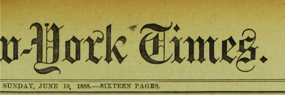
Letterforms as Identity: A Brief History of Typography at The New York Times
with
Kelly Doe
From hand-set beginnings in 1851 to current print and digital variations, typography has always been a defining characteristic of The New York Times identity.
Throughout its history, The Times has been an innovative and early adopter—there has always been a need to deliver the news as effectively as the technology of the moment allows. Yet its identity also evolved via the work of editors, art directors, type designers, and artists. Their intersecting relationships had considerable impact on the design of the news, the magazines, and the marketing.
This expansive look at New York Times typographic history will include such topics as: Black letter, logotypes and Q-heads; walking on the moon, the Pentagon Papers and 9/11; new typeface and digital development — and the creative impact of Lou Silverstein, Matthew Carter and many others.
The Herb Lubalin Lectures are recorded and made available here and on Vimeo with the generous support of Hoefler&Co.

About Kelly Doe