Typeface design education from Cooper Union
H Co double bill

An H&Co Double Bill: Behind the Scenes of Two Recent Projects
with Sara Soskolne

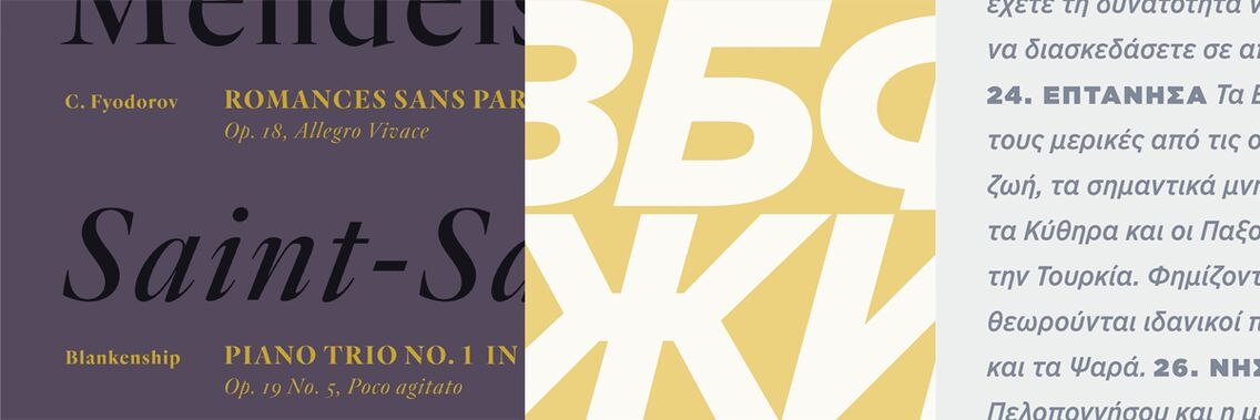
The typeface families Quarto and Gotham Greek & Cyrillic were both released in the past year, but the thinking and processes behind the development of these two projects couldn't have been more different. Quarto was an act of interpretation, its forms inspired by a historical model from 16th century Flanders; Gotham's language expansion demanded even more of the technical and optical trickery that the family already secretly employs in order to adapt its seemingly simple forms to the Greek and Cyrillic scripts across its exhaustive range of weights and widths. A look at two of the many hats a typeface designer might find herself wearing on any given day.

Registration is now closed

When:
Mon, December 7, 2015

Where:
The Rose Auditorium at Cooper Union
41 Cooper Square (at East 7th Street)
New York, NY 10003


The Herb Lubalin Lectures are recorded and made available here and on Vimeo with the generous support of Hoefler&Co.


About Sara Soskolne

Sara Soskolne 2015
Sara Soskolne is senior designer at Hoefler & Co. Though originally a graphic designer in her home town of Toronto, after ten years of apparently never being able to find quite the right typeface for the job she finally decided to just learn how to make them herself, jumping careers and an ocean to study typeface design at the University of Reading where she earned her MA in the subject in 2003. Since joining H&Co she has contributed to the design of a wide range of typefaces including Verlag, Chronicle, Sentinel, Gotham, Tungsten and Quarto. She has taught typeface design at the Yale School of Art, at New York’s School of Visual Arts, and with Sumner Stone was a founding instructor of the Type@Cooper Condensed Program.