
Designing Diacritics: more than a production detail
with
Aleksandra Samuļenkova
Today, it is crucial for type designers to provide fonts with a sufficiently designed beyond-basic Latin character set. I will give insights into the design of such characters in accordance with the preferences of their native readers.
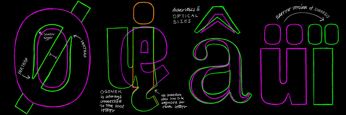
Participants will learn to master adequate shape, size, contrast and placement for various diacritical marks in different typographic contexts. We will analyse in detail the construction of tricky Latin characters such as ß, ð, ø, Æ, Ł, and many more. We will also look at diacritics-related spacing and kerning techniques, and will investigate differences between Roman, Italic and handwritten constructions of certain characters. I will discuss the origins and contemporary trends in design of the diacritical marks.
After a thoroughly illustrated lecture, the participants will practice their freshly gained knowledge by making and discussing quick sketches.
This workshop provides plenty of practical knowledge, and is also meant to encourage the participant to optimize their design process. Diacritical marks and accented characters are often left for later stages, and are seen as part of the production process rather than the design process. However, this attitude often costs the designer more time and effort than necessary and may result in poorly designed accented characters and bad typesetting for many languages.
I am eager to share the knowledge I gained over the years of practical work and research with type designers of any level.
For the hands-on part the students will require their preferred sketching tools, analog or digital.
About Aleksandra Samuļenkova

Aleksandra Samuļenkova is a Latvian-born type designer based in the Netherlands. She studied visual communication in Riga and Berlin and graduated from the TypeMedia master program at KABK in The Hague. Aleksandra designs for Latin, Cyrillic and (occasionally) Greek, and consults on the former two scripts. She is known for her award-winning Cyrillic and Greek extensions of notable typefaces (such as IBM Plex), and for her typeface Pilot—one of the few contemporary type designs that has been cast in metal. Aleksandra's area of competence additionally includes designing diacritics and special characters for the Latin script, and she enjoys lecturing and consulting on the topic.