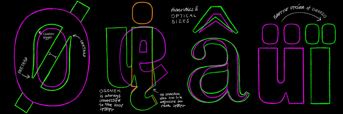
Designing Diacritics: More than a Production Detail
with
Aleksandra Samuļenkova
Characters beyond the basic Latin alphabet are frequently overlooked, despite their importance in many languages. Diacritical marks and accented characters are left for later stages, and are seen as part of the production process rather than the design process. Such an attitude can result in poorly designed accented characters and bad typesetting for the many languages with tricky diacritics. That in turn can force native readers to choose a better executed font, or even worse, can cause them to attempt to “fix” your typeface.
Today, it is crucial for type designers to provide fonts with a sufficiently designed beyond-basic character set. I will give insights into the design of accented characters in accordance with the preferences of their native readers.
The covered topics would include:
Shape, size, contrast, placement of the diacritical marks and extra Latin characters.
Surprising differences in construction of the diacritics between Roman, Italic and handwritten scripts.
Accented characters in combination with other characters: where special attention is needed.
Type family planning: consider diacritics early on in the process, to avoid later surprises.
Some theory, for example the origins of diacritical marks, brief history of their implementation in some orthographies, for better understanding of their importance.
Directions for further self-study, list of sources.
Contemporary tendencies in the design of diacritics.
About Aleksandra Samuļenkova

Aleksandra Samuļenkova is a Latvian-born type designer based in the Netherlands. She studied visual communication in Riga and Berlin and graduated from the TypeMedia master program at KABK in The Hague. Aleksandra designs for Latin, Cyrillic and (occasionally) Greek, and consults on the former two scripts. She is known for her award-winning Cyrillic and Greek extensions of notable typefaces (such as IBM Plex), and for her typeface Pilot—one of the few contemporary type designs that has been cast in metal. Aleksandra's area of competence additionally includes designing diacritics and special characters for the Latin script, and she enjoys lecturing and consulting on the topic.
