Uncharacteristic Characters
with
Jonathan Hoefler
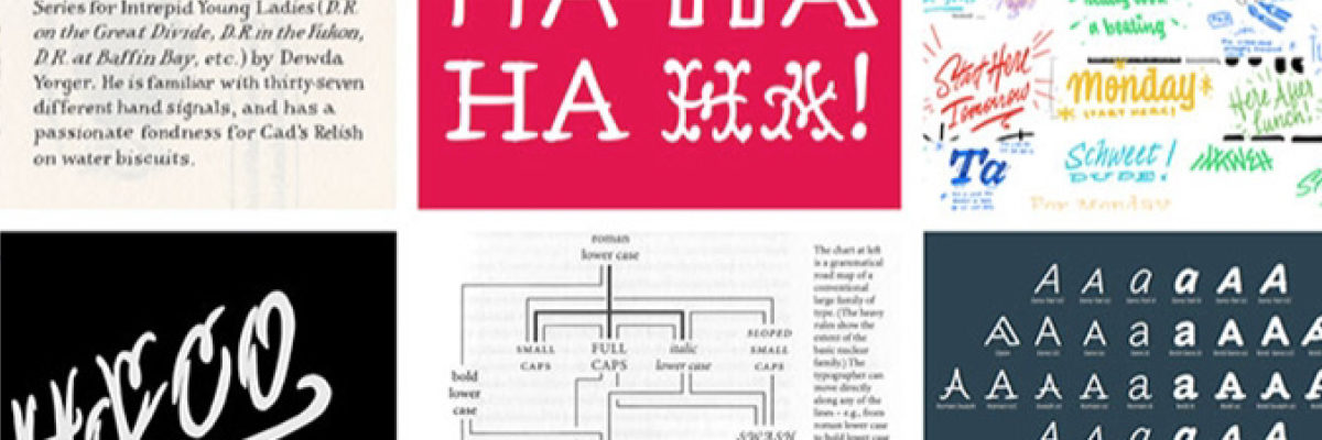
Jonathan Hoefler had never encountered a typeface in which the capital “I” needed to be taller than the “H.” But Inkwell isn’t an ordinary typeface. It’s the most uncharacteristic project ever undertaken by Hoefler&Co during their twenty-eight year history, and it questions what makes a “serious typeface” serious.
Visually, the design is unlike anything H&Co has ever done before, celebrating styles of lettering far outside their usual haunts. At the same time, it’s the quintessential H&Co project, exploring the kinds of themes that have defined some of their most familiar typefaces including Gotham, Surveyor, Ringside. This new design, by H&Co’s Jonathan Hoefler and Jordan Bell, pokes at the perimeter of the “type family,” it meditates on the relationship between the formal and informal, and it identifies how the needs of authors, as well as designers, should help guide what a twenty-first century typeface needs to be.
The Herb Lubalin Lectures are recorded and made available here and on Vimeo with the generous support of Hoefler&Co.

About Jonathan Hoefler