
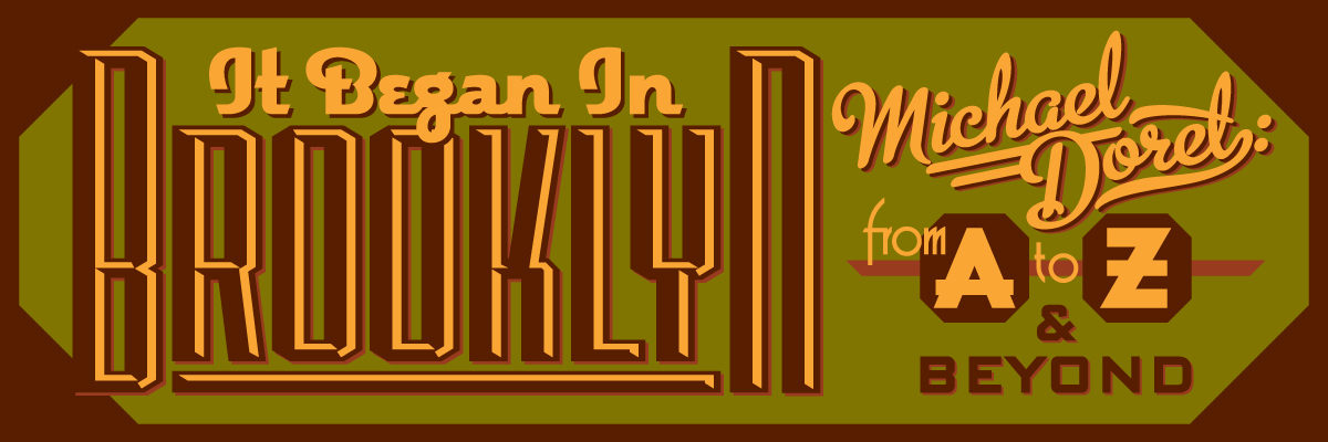
It Began In Brooklyn: From A to Z & Beyond
with
Michael Doret
Even if the name Michael Doret doesn’t ring a bell, you’re probably more familiar with his work than you may realize. You have most likely seen his logo for the NY Knicks, his covers for TIME magazine, or for the hardrock group KISS. Michael is one of the most celebrated practitioners of “integrated letterforms”; his award–winning work blurs the distinctions between the worlds of lettering, illustration, and graphic design.
More recently, Michael has been working in the realm of font design. His font “Deliscript” was accepted for inclusion in the TDC² 2010 Typeface Design competition, and received the Award of Excellence from Communication Arts in 2011. In 2012 both “Dynascript” and “Dynatype” were winners in in the typeface design category in Applied Arts Magazine’s Design Competition. In the same year Michael’s takeoff of Alex Steinweiss’ calligraphy “Steinweiss Script” was awarded Communication Arts Award of Excellence. Most recently in 2014 his attempt to delve into the world of blackletter fonts “Dark Angel” again won CAs Award of Excellence.
In his talk Michael will delve into his past and reveal the primal sources which drive his art: how his environment and surroundings while growing up in Brooklyn made deep and lasting impressions in his young mind which are still strongly evident in his work.
The Herb Lubalin Lectures are recorded and made available here and on Vimeo with the generous support of Hoefler&Co.

About Michael Doret

Michael Doret grew up in Brooklyn, New York near the tattered remains of the wonderful old collection of amusement parks known as Coney Island. Inspiration for his work came from those early years near the banners, signage and brilliant colors of his Brooklyn neighborhood, and from frequently visiting Times Square where his father worked for MGM among the bright lights, billboards, and general cacophony of the "Great White Way". Similar inspiration came later from such diverse sources as matchbook covers, enamel signs, packaging, and the numerous and varied artifacts of the mid-century America of his childhood.
After graduating from Cooper Union, and after several years at different staff positions, Michael set up a design studio in New York. He has, for many years, specialized in letterform art, and an integrated approach to the disciplines of lettering, illustration and graphic design. He currently runs a studio out of his home in Pasadena, California.
For many years he concentrated almost exclusively on logo and lettering projects, but in the early 2000s Michael expanded the base of his work to include font design. Michael’s original fonts and font families are available through his type foundry Alphabet Soup.