
Figures
with
John Downer
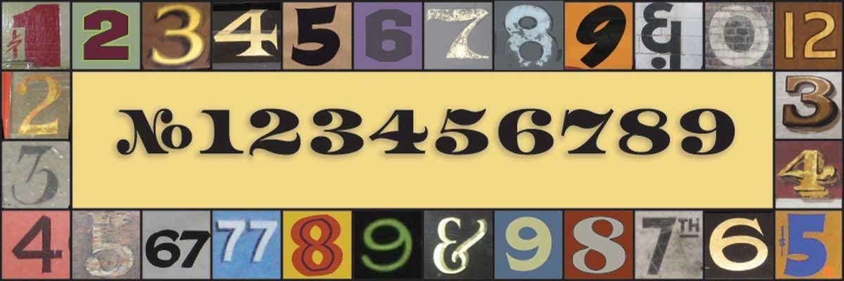
Have you ever seen a poster, a sign, or an example of hand lettering, and noticed numbers that don’t seem to go with the letters? What is it about the figures that make them appear incongruous?
When we design figures, why can’t we simply apply the same principles that we use for constructing Latin letters?
Over the course of his long career, sign painter and type designer, John Downer, has made a thorough study of letters and numbers. He has helped students “figure out” how & why the shapes and proportions must look a certain way to be read easily. Quick recognition of individual figures is important. Normally, we read digits one-by-one ... and not as “word shapes.” This means that if even a single digit is indistinct, the reader will experience difficulty. Avoiding ambiguity is an important objective, but so is compatibility. Numeric characters must harmonize with alpha characters. John will patiently guide the class through a series of exercises to overcome common pitfalls, and will show various tricks for making figures read well, both at short range and at long range.
Required Materials
- no. 2 pencil
- kneaded eraser
- pencil sharpener
- ruler
- sketch paper around 9" x 12" or bigger
- some sheets of tracing paper 9" x 12" or bigger
- variety of black markers from very fine to wide
- 120 pt printout of capitals and lowercase of your typeface design in progress
- reducing lens
- scanner/camera or phone/tablet to take photos of work
- computer with reliable internet connectionZoom app (recommended)
- This workshop is intended for typeface designers with WIP.
A link to join a Zoom meeting will be sent to enrolled students a day or so before the class begins.
About John Downer

Mr. Downer is a sign painter, a typeface designer, and an educator. He has written about type and type history for various publications and is widely known as a perceptive type critic. His typefaces have been published by Bitstream, Font Bureau, Emigre, House Industries, and Design Lab. Among his most popular type designs are Iowan Old Style (on Apple Books and iOS 7+), Roxy, Ironmonger, and the ubiquitous food and beverage branding favorite, Brothers.
A native of the Pacific Northwest, a region of the US with a rich history of sign painting and hand-lettering, Mr. Downer was first introduced to commercial pen & brush lettering in the 1960s in junior high school. He began an apprenticeship in a sign painting shop at age 18. He holds BA, MA, and MFA degrees in art.
Mr. Downer has been a journeyman sign painter since 1973, a freelance typeface designer since 1983, and a crusader for designers’ rights his entire adult life. He began teaching lettering at the university level in 1972, making him one of the most experienced American educators in the fields of lettering and typeface design. He’s been teaching in the Type@Cooper program at The Cooper Union since its founding in 2010. He established the Sign Painting Support Group on Facebook as a platform to educate and guide serious enthusiasts and professionals in the principles of letter construction and the tricks of the trade.